
Framer Surveys: Build, Embed & Analyze Fast in Framer
Why Framer Surveys Beat “Guessing What Users Want”
If you build pages in Framer, you already know how fast you can go from idea → polished UI. The risky part is that speed can trick us into shipping “what looks right” instead of “what people actually want.” That’s where framer surveys earn their keep: they turn opinions into inputs, and inputs into decisions you can defend.
The hidden cost of building without feedback
I’ve watched teams burn weeks perfecting a hero section, only to discover the offer was unclear—or worse, aimed at the wrong buyer. Without direct feedback, you end up optimizing the wrong things: button colors, animations, fancy interactions. Framer surveys cost a fraction of that time and usually reveal the real blocker within a day or two.
The “hidden cost” isn’t just dev/design hours; it’s opportunity cost. Every sprint spent polishing the wrong message delays learning what would actually increase signups, demos, or purchases. If you’re using a UI kit like frameblox.com to ship faster, pairing that speed with survey feedback is how you avoid sprinting in the wrong direction.
When a survey is better than analytics alone
Analytics tell you what happened—bounce rate, scroll depth, conversion rate. But it rarely tells you why. A quick on-page poll like “What stopped you from signing up today?” can uncover missing pricing info, unclear positioning, or a trust issue that heatmaps can’t fully explain.
This is why survey analytics for websites matters: you’re collecting intent and perception, not just clicks. And if you want Framer-native-ish collection and styling, tools like FramerForms | Custom forms in Framer can bridge the gap between a static form and a real feedback pipeline.
Choosing the right survey moment on your site
The best framer surveys show up when the visitor has enough context to answer, but not so late that they’ve already left. In practice, that means after they’ve read the hero + one proof section, after a pricing section, or right after a key action (like clicking “Get Started” and hesitating).
I like to think in “moments”: pre-decision (clarity), decision (objections), and post-decision (onboarding). If you match your survey to the moment, you get answers you can actually act on—without annoying people or tanking conversion rates.
Pick Your Survey Style: Micro-Polls vs Deep-Dive Forms
Not all framer surveys should look like a 12-question research form. The format you pick should match the decision you’re trying to make. If you want direction fast, go small. If you’re validating a bigger change—like a new audience or a new pricing model—go deeper.
One-question polls for quick direction
Micro-polls are the MVP of feedback: one question, one tap, done. They’re perfect for message testing (“Which headline is clearer?”) or quick segmentation (“Are you building a portfolio or a SaaS site?”). You’ll usually get higher response rates because the effort is tiny.
On Framer sites, micro-polls also help you learn without heavy redesign. You can place a single question under a feature list or in a sticky corner widget and start collecting insights the same day. For busy teams, this is often the fastest win with framer surveys.
Multi-step surveys for higher completion
This sounds backward, but multi-step forms can outperform long single-page forms because they feel lighter. One question at a time reduces cognitive load, and progress cues (“Step 2 of 5”) make people feel invested. If you’re running a Typeform embed Framer flow, this is a common strength.
The key is to keep each step simple and avoid big text walls. I’ve found that 5–7 steps with mostly multiple-choice can be easier to finish than a “short” form with 12 fields on one screen. When you need deeper insight, multi-step is often the sweet spot for embed survey in Framer projects.
Qualitative prompts that actually get answers
If you want answers that aren’t fluff, your open-text prompt needs guardrails. Instead of “Any thoughts?”, ask “What’s the one thing missing on this page that would help you decide?” or “What would you compare us to?” That specificity pulls real insights out of busy people.
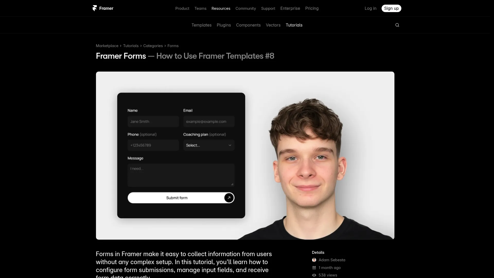
When you’re building with Framer, it also helps to learn from creators who’ve already mapped the workflow. This Framer Forms: Free Tutorial by Adam is a practical reference if you’re choosing a Framer form builder approach and want a feel for how forms behave in real projects.
What Framer Can (and Can’t) Do Natively for Surveys
Framer is excellent at layout, components, and shipping fast—but “surveys” can mean a lot of things. There’s basic data capture (name/email/message) and then there’s true survey logic (conditional branching, scoring, piping answers into later questions). Understanding the gap helps you pick the right tool without wasting time.
Native forms vs true survey logic
Framer’s native form capabilities (and many “form-like” setups) are great for lead capture and simple submissions. You can create clean inputs, connect them to a destination, and style them to match your brand. For many teams, that’s enough to run lightweight framer surveys like “What are you building?” plus an email field.
True survey logic is where things get tricky. If you need “If user selects A, show questions 5–7,” that’s branching logic—usually handled by dedicated survey tools. A lot of “forms” can’t do it elegantly without integrations or a separate platform.
Workarounds for conditional questions
If you want basic conditional behavior without leaving Framer, a common workaround is to split the survey into screens. You can route users to different pages or modals based on button choices (e.g., “I’m a freelancer” vs “I’m a startup”), and each path asks a slightly different set of questions.
This isn’t perfect—your data ends up separated across forms or endpoints—but it’s surprisingly effective for early validation. When I’ve used this approach, I keep the branching to 2–3 paths max so analysis stays manageable and the embed survey in Framer experience stays smooth.
When you should use an external tool
If you need advanced logic, scoring, answer piping, or robust reporting, an external tool is usually the cleanest answer. That’s especially true when stakeholders want a dashboard, export options, and reliable survey analytics for websites without manual cleanup.
For tool comparisons and templates tailored to Framer, this roundup is handy: Best Framer Survey Tool, Templates &. The big takeaway: use Framer for what it’s best at (UI + speed), and lean on specialized tools when your survey requirements get serious.
Fastest Ways to Add Surveys to Framer (No-Code First)

If your goal is to ship quickly, you don’t need to overthink it. The fastest framer surveys are usually embeds, because you can keep your Framer layout intact while letting a survey tool handle data capture and reporting. The trick is embedding cleanly so it feels intentional, not like a random iframe stuck in the middle of a beautiful page.
Embed Google Forms cleanly
A Framer Google Forms embed is the quickest “good enough” option for internal validation or early-stage research. Google Forms is free, easy to duplicate, and familiar to most teams—plus it gives you a spreadsheet output without extra setup. The downside is styling: it can look off-brand unless you frame it thoughtfully.
To make it feel cleaner, place the form in a section with your site’s background color, add a short headline above it, and give it breathing room. If the embed feels visually heavy, consider linking to the form in a modal or separate page rather than forcing it into a tight layout.
Drop in Typeform or Tally with minimal styling pain
If you care about presentation and completion rates, a Typeform embed Framer flow is often worth it. Typeform’s multi-step UI feels modern by default, and it’s built to reduce drop-off. Tally is another strong option: simpler, fast, and easier to make feel “website-native” in many cases.
My rule: if you need brand polish and a guided experience, Typeform; if you need speed, flexibility, and straightforward forms, Tally. Either way, your job in Framer is to create context: explain why you’re asking, how long it’ll take (in seconds), and what happens after they submit.
Button-to-modal and page-to-page survey flows
Not every survey needs to live directly on the landing page. A button-triggered modal works well for micro-polls, especially when you want the user to answer without losing their place. It’s also a nice compromise when you’re worried an embed will disrupt scrolling or page performance.
For deeper surveys, I prefer page-to-page flows: send users to a dedicated “Quick Questions” page with a clean layout, fewer distractions, and a clear thank-you state. If you’re using a component library like Components, you can spin up a consistent survey page layout fast and reuse it across campaigns.
Make It Look Native: Design Tips So Your Survey Matches the Site
The biggest giveaway that you’ve bolted on a survey is visual mismatch: fonts are different, spacing is cramped, and the embed looks like a foreign object. When framer surveys look native, people trust them more—and that alone tends to increase completion. You don’t need perfection, but you do need consistency.
Typography, spacing, and layout rules that boost completion
Start with type: match the font family and approximate size of your site’s body text, then increase line height slightly for readability. If the embed can’t inherit your font, wrap it in a section where your headline and supporting text carry the brand, and the form feels “contained” rather than mismatched.
Spacing matters more than most people think. Give the survey a clear container with 24–40px padding on desktop and 16–24px on mobile, and avoid placing it directly against other dense sections like pricing tables. When the page feels calm, people are more willing to spend 30 seconds answering.
Mobile-first survey UI patterns
Most landing pages get a meaningful share of mobile traffic, and embeds can misbehave on smaller screens. Test the form at 360px width and make sure the user can scroll inside the embed without getting “stuck.” If scrolling feels broken, switch to a full-page survey route instead of forcing an inline embed.
Also, avoid side-by-side layouts around your survey on mobile. Keep it single-column, with a short prompt above the form and a privacy note below it. When I optimize framer surveys for mobile, I aim for “thumb-friendly” spacing and minimal distractions.
Progress indicators and friction killers
People are more likely to finish when they know how long it’ll take. A simple line like “3 questions, takes about 20 seconds” often beats fancy design tweaks. If your tool supports progress bars, use them—but keep steps low enough that progress feels real.
Remove friction wherever you can: don’t require email unless you truly need it, don’t ask two questions that measure the same thing, and avoid long dropdown lists. You want the path of least resistance, especially if the survey sits near a conversion point and you don’t want it competing with signups.
Higher Response Rates Without Being Annoying

There’s a fine line between “helpful feedback request” and “popup that makes me leave.” The good news: you can increase responses to framer surveys without pestering people. Most response-rate improvements come from better framing, smarter timing, and ruthless editing.
Offer framing: incentives, reciprocity, and clarity
You don’t always need incentives, but you do need clarity. Tell people exactly why you’re asking and what you’ll do with the feedback. A line like “Your answer helps us prioritize what to build next” works because it signals purpose, not marketing.
If you do offer an incentive, keep it simple and proportional: early access, a small discount, or a resource. For example, a team using a design system might offer a “mini kit” or a layout template—something aligned with the audience. The best incentives feel like a thank-you, not a bribe.
Timing triggers: exit intent, scroll depth, and post-action
The “when” matters as much as the “what.” Exit-intent surveys can capture objections, but they can also irritate users if overused—so reserve them for high-intent pages like pricing. Scroll-depth triggers (like 60–70%) often perform better because the visitor has already engaged with your content.
Post-action triggers are my favorite: after someone downloads a resource, clicks a key CTA, or completes signup, ask one question while the experience is fresh. This is where framer surveys can feel natural: you’re not interrupting, you’re following up.
Keeping surveys short while staying useful
Short doesn’t mean shallow. A great 2–3 question survey can beat a 12-question monster if each question maps to a decision. I usually aim for one quantitative question (multiple choice), one qualitative question (short text), and one optional contact field.
If you need more depth, split the work: run a micro-poll first, then invite a small subset to a longer survey. That approach keeps your main site experience clean while still giving you richer feedback from the people most willing to share.
Data You Can Trust: Avoiding Bias, Leading Questions, and Garbage Inputs
Collecting responses is the easy part. The hard part is making sure the responses mean something. Badly written questions can push people toward the answer you want, and sloppy forms invite junk data. If you’re relying on framer surveys to guide product or messaging decisions, this section is where you protect your future self.
Question wording that reduces bias
Leading questions sound subtle, but they skew results fast. “How helpful is our amazing UI kit?” is basically asking for compliments. A better option is neutral: “How would you rate the usefulness of this UI kit for your next project?” and provide a balanced scale.
Also watch for double-barreled questions like “Is the site clear and trustworthy?” If someone thinks it’s clear but not trustworthy, you’ve forced a messy answer. Split it into two questions or decide which attribute matters more right now.
Sampling and small-sample traps
If you only survey people who already love your product, you’ll get biased positivity. If you only survey people who bounce, you might overweight edge-case objections. Try to sample across key segments: new visitors, returning visitors, trial users, and paying customers if you have them.
Small samples can still be useful, but treat them as directional. If 8 out of 10 people say pricing is confusing, that’s a signal worth investigating—not a statistical truth. I like to pair survey analytics for websites with a quick session review or a few user interviews to confirm patterns.
Validation and “other” fields done right
Garbage inputs usually come from unclear expectations. If you ask for a budget, say which currency; if you ask for a timeline, offer ranges; if you ask for email, clarify what you’ll send. Basic validation (like email format checks) prevents accidental junk.
For multiple-choice questions, include an “Other (please specify)” option when your list might be incomplete. But don’t overuse it—too many “Other” fields make analysis painful. A good compromise is to offer “Other” only on questions where you genuinely expect diverse answers.
From Responses to Decisions: Turning Survey Data Into Product Changes
Responses aren’t valuable until they change what you do next. The real win with framer surveys is using them to make decisions faster—what to build, what to cut, and what to clarify on the site. You don’t need a data science team; you need a simple, repeatable process.
Tagging and clustering open-text answers
Open-text responses are messy, but they’re where the gold is. Start by tagging each response with 1–2 themes: “pricing clarity,” “missing integration,” “performance concerns,” “wants templates,” and so on. After 30–50 responses, patterns start to show up even without fancy tooling.
I also like to save memorable quotes in a “voice of customer” doc. Those phrases often become your best landing page copy because they match how real people talk. If Frameblox users say “I just want sections that already look good together,” that’s a positioning clue worth testing.
Prioritizing fixes with impact vs effort
Once you have themes, sort them using a simple impact/effort matrix. High-impact, low-effort fixes should ship first—things like clarifying a headline, adding a pricing FAQ, or improving a component preview. For a design system business, even reorganizing categories can reduce friction fast.
Here’s a quick example table you can use in your notes or Notion:
| Theme | Estimated Impact | Effort | Next Action |
|---|---|---|---|
| Pricing unclear | High | Low | Rewrite pricing section + add comparison |
| Need more component variants | Medium | High | Bundle into next release scope |
| Confusing navigation | High | Medium | Prototype new IA + test with micro-poll |
Creating a feedback loop users notice
People give better feedback when they believe it matters. If you change something based on survey input, tell them. Add a small “You asked, we shipped” note in your changelog, email, or even a banner in your product.
This loop is especially effective for UI kit and component library audiences—designers love seeing iteration. When your visitors notice you act on feedback, framer surveys become easier to run because users are more willing to participate next time.
Privacy, Consent, and Compliance Basics for Website Surveys

Even a simple one-question poll can touch personal data if you collect emails, IP addresses, or identifiers through embedded tools. I’m not a lawyer, but there are a few practical habits that keep your framer surveys safer and more respectful—especially if you have EU/UK visitors or you’re using third-party embeds.
What to disclose before collecting data
Before the form, say what you’re collecting and why. If you ask for an email, tell them what they’ll receive and how often. If it’s anonymous, say that too—people answer more honestly when they know you’re not tying responses to their identity.
A short line like “We’ll use this feedback to improve the product. No spam.” is better than silence, but the best approach is linking to your privacy policy near the submit button. Keep it visible without turning the page into legal clutter.
Handling cookies, tracking, and embedded tools
Embedded survey tools may set cookies or collect device data depending on configuration. That can matter for consent banners and tracking disclosures. If you’re using a Typeform embed Framer or Framer Google Forms embed, assume the embed behaves like a third-party service, because it does.
Practically, review what your survey tool collects, and ensure your cookie/consent setup reflects that. If you’re trying to keep things lightweight, consider using minimal tracking on survey pages and avoid stacking multiple analytics tools on top of the embed.
Retention, deletion, and access requests
Set a retention habit: don’t keep raw survey data forever “just in case.” Decide what you need (themes, counts, key quotes), extract it, and delete old raw exports when they’re no longer useful. This reduces risk and keeps your dataset cleaner.
If someone asks to access or delete their data, you need a way to comply—especially if you collect emails. That’s another reason to avoid collecting identifying info unless you truly need it. Many framer surveys work perfectly well with anonymous responses.
Real-World Framer Survey Recipes You Can Copy Today
Templates are nice, but recipes are better—because they tell you when to use a survey, what to ask, and how to act on results. Below are a few framer surveys I’d run if I were optimizing a Framer UI kit and design system site like Frameblox, where clarity and trust drive conversions.
Landing page message testing survey
Goal: pick the headline/value prop that makes sense fastest. Place a one-question poll right under the hero: “What are you here for today?” with options like “UI kit,” “Design system,” “Framer components,” and “Just browsing.” This tells you whether your hero matches visitor intent.
Follow it with an optional text prompt: “What would you change to make this page clearer?” Those answers often point directly to missing proof, unclear positioning, or confusing terminology. Then update the hero and rerun the same framer surveys for a week to see if clarity improves.
Post-purchase or post-signup onboarding survey
Goal: understand who bought and what “success” looks like for them. After checkout or account creation, ask: “What are you building?” “What’s your timeline?” and “What’s the #1 thing you want from this kit?” Keep it to 3 questions so it feels like onboarding, not paperwork.
The best part is operational: you can tailor email onboarding and docs based on common answers. If many people say they’re building marketing sites fast, you can highlight your section library and navigation patterns first. If they say they need code components, point them toward Code components early.
NPS-style pulse survey for returning users
Goal: track satisfaction without overengineering. Use a lightweight NPS-style question: “How likely are you to recommend Frameblox to a friend?” (0–10) and a follow-up: “What’s the main reason for your score?” Run it for returning users after they’ve had time to explore components.
Don’t obsess over the number; focus on themes in the follow-up. If “hard to find sections” shows up repeatedly, that’s a navigation/IA fix. If “need more variants” shows up, that’s roadmap input. This is one of the simplest framer surveys that still produces clear action items.
Common Framer Survey Problems (and Quick Fixes)
Even when you pick the right tool, the day-to-day issues can be annoyingly specific: an embed that won’t resize, a scroll area that traps your finger on mobile, or a thank-you page that never loads. The good news is most framer surveys problems have straightforward fixes once you know where to look.
Embed sizing, scrolling, and responsive issues
The classic issue: your iframe is too short, so the form gets cut off, or it creates nested scrolling that feels broken. Fix it by giving the embed a generous height (often 700–1000px for multi-step forms) or by switching to a full-page survey route. For mobile, avoid putting the embed inside a container with fixed height.
If your tool supports “auto height,” use it—but still test on real devices. I also recommend creating a dedicated “Survey” page built from your standard layout sections so you can control spacing and reduce conflicts with other components.
Spam prevention and bot-proofing
If you publish a public form, bots will find it eventually. Most survey tools offer basic protection (CAPTCHA, hidden honeypot fields, rate limiting). Turn something on—especially if the form writes to a spreadsheet or triggers automations.
A practical approach is to avoid collecting anything that triggers value for bots (like sending an instant coupon code). If you need an incentive, deliver it after manual review or via a double opt-in email. That keeps your framer surveys data cleaner and protects your workflows.
Broken redirects and thank-you states
Nothing kills trust like clicking “Submit” and landing on a blank page. Always test your thank-you state on desktop and mobile, and test it again after you publish changes. If you’re redirecting to a Framer page, make sure the URL is correct and publicly accessible.
I like to keep thank-you pages simple: a confirmation message, what happens next, and one optional next step (like “Explore components”). For Frameblox, that might be a link to All components so users can keep moving while you collect responses in the background.
Your Next 7 Days: A Simple Plan to Launch, Learn, and Iterate
If you’re busy (and you are), the hardest part is turning “we should run a survey” into a real workflow. This seven-day plan is how I’d ship framer surveys without letting them become a long “research project.” The goal is not perfect data—it’s a clear insight and one shipped improvement.
Day 1–2: define goal and draft questions
Pick one decision you want to make. Examples: “Is the value prop clear?” “Which audience is landing here?” “What’s blocking purchases?” Then draft 2–4 questions max, with one optional open-text prompt for nuance. If you can’t explain how an answer changes what you do, cut the question.
Write neutral options and keep language simple. Busy visitors won’t decode jargon. If your site sells a design system, say “components” and “sections” the way your users do—browse your own Styles and component labels and mirror that vocabulary.
Day 3–5: embed, test, and publish
Choose the fastest implementation: embed on-page, modal trigger, or separate survey page. Then test like a slightly paranoid person: mobile Safari, Chrome, desktop, and at least one slow connection. Make sure the form loads, scrolls, submits, and shows a clear success message.
If you’re iterating your site quickly (which Framer makes easy), keep the survey stable for a few days so you’re not changing the question mid-collection. And if you want a clean baseline, publish the survey with minimal other page changes during this window.
Day 6–7: analyze results and ship one change
At the end of the week, summarize in a short “decision note”: top themes, biggest blocker, and one recommended action. Don’t overcomplicate it—just pick one change you can ship in a day. That might be rewriting a headline, adding a proof section, or clarifying what’s included.
Then rerun the same framer surveys for another week to see if the signal improves. This is the compounding effect: small survey → small change → better clarity → better conversions. If you want a fast way to implement those changes with consistent design, a library like Old Home can be a handy reference for layout patterns you can adapt quickly.
Soft next step: If you’re building in Framer and you want your survey pages (and the rest of your site) to look consistent without burning hours on layout, start with a reusable section template, add one micro-poll, and ship it this week. That’s usually the quickest path from “guessing” to learning—with framer surveys doing the heavy lifting.
This article was created using Blogie.