
Framer Testimonial Component: Build Trust That Converts
 Solt Wagner
Why a Single Testimonial Can Outperform Your Best Copy
Most websites don’t lose conversions because the product is bad—they lose because the visitor isn’t sure they can trust you yet. You can write a beautiful headline, explain every feature, even add slick animations… and a short quote from a real customer still beats it. A strong framer testimonial component works like a shortcut: it lets someone else “vouch” for you when your own copy naturally feels biased.
What visitors look for before they believe you
When someone lands on a SaaS page, they’re quietly scanning for signals: “Is this legit?”, “Is it for people like me?”, and “Will it actually work?” In my experience, visitors care less about perfection and more about specificity—names, roles, recognizable brands, and results that sound like a real person wrote them.
If you sell something like Frameblox—a UI kit and design system meant to save serious build time—people want proof that it’s not just pretty components. They want reassurance that the library is structured, consistent, and actually speeds up shipping. That’s where Framer testimonials shine, because they can validate the exact promise your product makes.
Where testimonials matter most on a page
Testimonials hit hardest near “decision points”: around pricing, right before a form, or immediately after you make a bold claim. If your hero says “Launch faster with 900+ sections,” a well-placed customer review underneath can remove doubt without adding another paragraph of marketing copy. This is why I treat a framer testimonial component as part of the conversion layout, not decoration.
If you want quick inspiration, browsing Testimonial UI Components & Animations can help you spot patterns—like how many reviews they show, what metadata they include, and whether the layout feels trustworthy or too polished.
The “too good to be true” problem (and how to fix it)
The fastest way to make testimonials backfire is to make them sound like ad copy. If every quote says “This is the best thing ever!!!”, visitors feel manipulated and your credibility drops. A high-trust social proof UI includes a mix of tones—some enthusiastic, some practical, all believable.
To fix the “too good” vibe, add context: what the customer built, how long it took, or what pain it solved. Even small details like “We rebuilt our marketing site in two days using Frameblox sections” sounds grounded. Your framer testimonial component should make room for those specifics.
Pick the Right Testimonial Format for Your Site Goals
Not all testimonials need the same layout, and picking the wrong format can quietly hurt conversions. The best choice depends on what the page is trying to do: explain, reassure, or push someone over the line to sign up. A framer testimonial component is most effective when it fits the user’s reading flow instead of fighting it.
Static card grids for clarity and skimmability
If you have multiple strong reviews and enough space, a grid is the most “honest” format because it doesn’t hide content behind interaction. People can scan names, roles, and key phrases quickly, which is perfect for a product like Frameblox where visitors might be comparing alternatives. Grid-based Framer testimonials also tend to be easier to keep accessible and stable across breakpoints.
I’ve found grids work especially well on landing pages that already have a lot of scrolling content. You’re not asking the user to do extra work; you’re just giving them proof in a straightforward way. If your goal is trust and clarity, a grid-first customer reviews component is a safe bet.
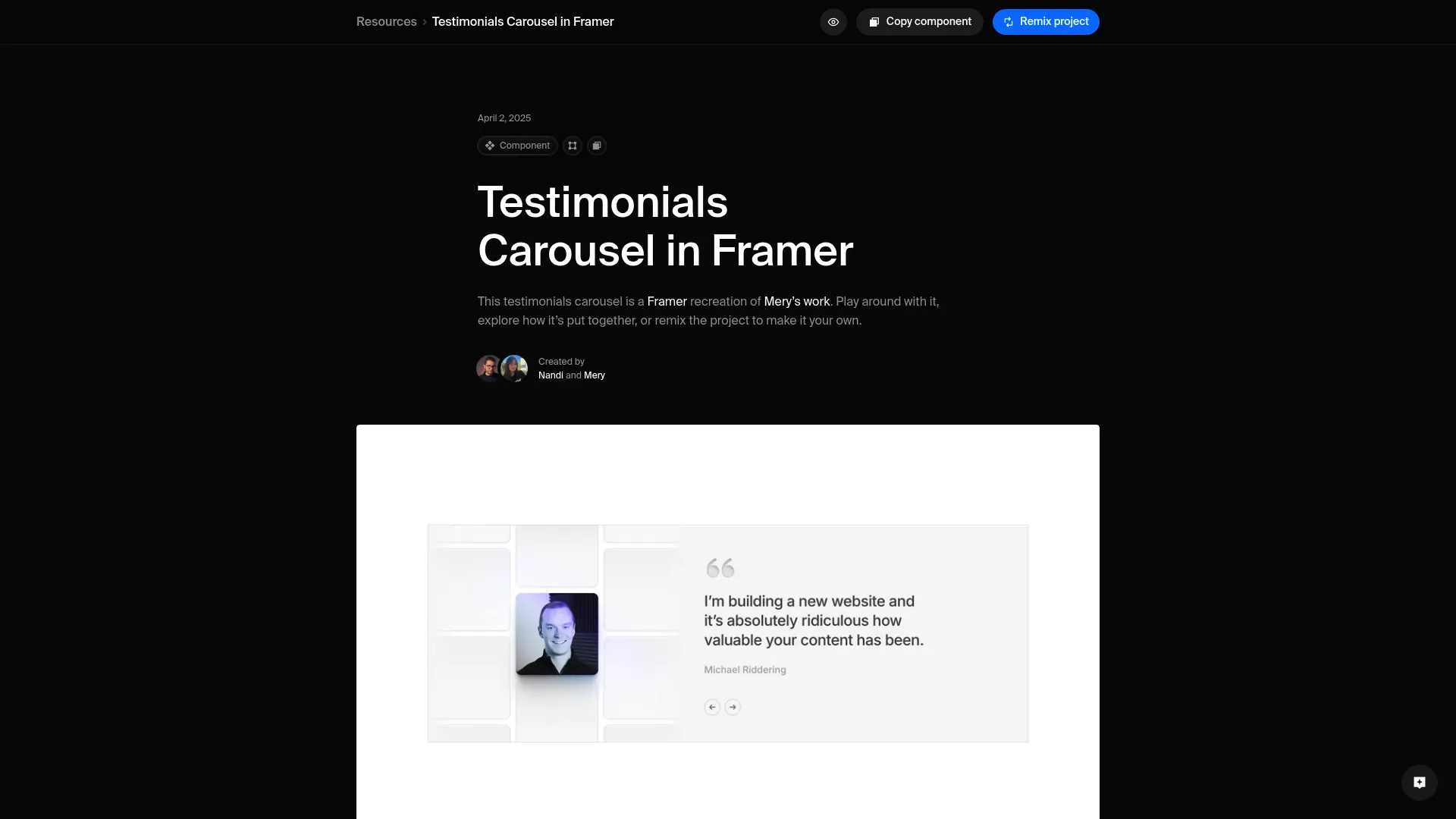
Sliders and carousels for tight layouts
Sliders shine when you want social proof in a smaller footprint—like in a hero section, a sidebar, or near a pricing toggle. The trade-off is that you’re hiding most testimonials until the user interacts, so the first slide needs to carry real weight. If you do go slider, build it intentionally as a testimonial slider Framer component with clear controls and good keyboard support.
If you’re learning the mechanics, Testimonials Carousel in Framer is a helpful walkthrough to understand carousel logic, responsiveness, and how to avoid that “janky” feeling. A well-built framer testimonial component slider should feel calm, not like it’s begging for attention.
Video, logo, and quote hybrids when stakes are high
For higher-consideration decisions—agency retainers, big annual plans, enterprise add-ons—hybrids can outperform simple quotes. A logo row plus short quotes adds recognition, while a short video clip can communicate authenticity instantly (even if you keep it optional). For Frameblox, a hybrid might show a recognizable company logo, a 1–2 sentence quote, and the exact deliverable: “marketing site,” “docs,” “product landing pages,” etc.
The key is moderation: one strong hybrid block can do more than ten weak quotes. If you’re building a premium-feeling framer testimonial component, treat video as a “proof upgrade,” not a requirement for every testimonial.
Anatomy of a High-Trust Framer Testimonial Component
A testimonial design can look gorgeous and still feel fake if it’s missing the details people subconsciously look for. The anatomy matters: what you include, what you leave out, and how you structure the information. When I’m auditing a framer testimonial component, I’m basically asking, “Would I believe this if I didn’t already like the brand?”
The must-have fields: name, role, company, proof
At a minimum, include the person’s name and a role that makes sense for the product (designer, founder, marketing lead, developer). Adding a company name or website instantly increases credibility, especially for a B2B audience that wants to know “who is this working for?” If you can, include a proof hint: the project type, timeframe, or measurable outcome—small details that make Framer testimonials feel earned.
For Frameblox specifically, proof can be very practical: “We rebuilt our page library in a weekend,” “We shipped a new homepage in 3 hours,” or “The design tokens saved us from style drift.” Your customer reviews component should have dedicated fields so those proof details don’t get crammed into one awkward paragraph.
Photos vs. logos: when each helps (or hurts)
Photos feel personal and are great when you’re selling to individuals or small teams—people connect with faces quickly. Logos feel more “business,” and they’re helpful when brand recognition is part of the trust signal, especially if you have permission to use them. The mistake is using random stock headshots; that tends to lower trust because it feels like filler.
If you don’t have a real photo, use a logo or a simple initial-based avatar that matches your brand style. A well-designed framer testimonial component can support both with a clean fallback, so you’re not forced into a fake-looking presentation.
Microcopy that increases believability
Microcopy is the small supporting text most people don’t notice—until it’s missing. A simple line like “Verified customer” (only if you actually verify) or “Built in Framer” can anchor the review in reality. Even date ranges like “Using Frameblox since 2024” make the quote feel less like a one-off compliment.
If you want to plug in a slider quickly, tools like Testimonials Slider plugin for Framer - can be a starting point, but I’d still recommend shaping the content fields to match your brand and your product claims. The best framer testimonial component is the one that supports believable content, not just pretty layout.
Build It in Framer: From One Card to a Reusable Component

Building a testimonial card is easy. Building a framer testimonial component you can reuse across 10+ pages without breaking layouts—that’s where the real time savings are. If you’re using Frameblox already, you’ll appreciate this approach because it mirrors how good component libraries are structured: one solid base, then controlled variants.
Design a single testimonial card with smart constraints
Start with one card and design it like it’s going to be stress-tested. Set max widths for the quote text, define consistent padding, and decide what happens when the quote is long. In Framer, constraints and stacks matter a lot here—build with responsive behavior in mind so the card doesn’t explode on mobile or collapse awkwardly on wide screens.
I usually set the quote text to a comfortable line length and make the name/role block a separate stack. That way, changing text length doesn’t push the avatar into weird positions. This is the foundation of a reliable framer testimonial component, and it pays off later when you add multiple variations.
Convert to a component and define props
Once the card feels stable, convert it into a component and immediately define props for the things you’ll change most: quote text, name, role, company, avatar/logo, and maybe a “rating” toggle if you use stars. Props are what keep you from duplicating 30 slightly different testimonial cards that become impossible to update. For busy teams, this is basically the difference between “manageable” and “why did we do this?”
If you plan to use this across a library like Frameblox, name your props clearly (e.g., Quote, Name, Role, Company, Avatar). A tidy prop structure makes your framer testimonial component feel like a real product asset, not a one-off design.
Create variants for short, medium, and long quotes
Variants are the secret weapon for testimonials because real customer quotes rarely come in the same length. Create at least three variants: short (1–2 lines), medium (3–5 lines), and long (6–10 lines) with slightly different spacing and type settings. You’re not “cheating”—you’re acknowledging that content varies and designing for it.
I’ve found this also makes it easier to build consistent sections: your grid can mix quote lengths without looking messy. With variants, your framer testimonial component stays visually balanced, even when the words are unpredictable.
Make Testimonials Easy to Maintain (Without Breaking Layouts)

Testimonials are one of those things you’ll update forever—new customers, new quotes, new brands, new positioning. So the real question isn’t “can you build it?” It’s “can you maintain it without dreading it?” A good framer testimonial component should be built for ongoing edits, not just launch day.
Using CMS collections for reviews at scale
If you’re showing more than a handful of testimonials, using Framer’s CMS is the cleanest way to manage them. Create a collection with fields that match your component props: quote, name, role, company, avatar/logo, and optional tags like “pricing,” “design system,” or “speed.” Then bind your testimonial instances to the CMS so updates don’t require manual layout edits.
For Frameblox, CMS-driven Framer testimonials are especially useful because you might want different sets on different pages—homepage highlights, component library page reviews, and maybe a “design system” subset. CMS filtering lets you keep one customer reviews component pattern and repurpose it across the site.
Fallbacks for missing photos, long titles, and edge cases
Edge cases are where testimonial sections fall apart: someone has a long job title, a company name that wraps twice, or no avatar at all. Design fallbacks intentionally—an initial avatar, a default logo badge, and text truncation rules where appropriate. It’s better to show a clean fallback than to let the layout break and look sloppy.
I typically add a maximum of two lines for role/company, then let the quote carry the meaning. If you need the full text, reveal it on click or on a dedicated case study page. A stable framer testimonial component should look “designed” even when the content isn’t perfect.
Naming, slots, and structure for future edits
One underrated trick is naming layers and slots like you actually plan to revisit them. “Text 12” becomes useless the moment you duplicate it across multiple sections. Name your stacks clearly (Quote, Author, Meta, Badge), and keep a consistent structure so future you—or a teammate—can jump in and update without fear.
If you’re building a system like Frameblox, consistency is the whole point. A well-structured framer testimonial component feels like part of your design system, not a random chunk of UI. It also makes it much easier to drop testimonials into pages built from Components and keep everything cohesive.
Grid, Slider, or Marquee? Choosing Motion Without Annoyance
Motion can make testimonials feel more dynamic, but it can also make them feel less trustworthy if it turns into a distraction. When you animate social proof, you’re basically saying, “Look at this.” If the animation is too aggressive, visitors may assume you’re compensating for weak proof. The best framer testimonial component motion is subtle, predictable, and easy to control.
When a slider improves UX vs. hides proof
A slider improves UX when space is limited and when the first testimonial is strong enough to stand on its own. Think hero sections, narrow columns, or compact layouts where a full grid would push critical content too far down. The risk is that users don’t interact, so they only see one review—your strongest quote needs to be first, every time.
If you have a lot of social proof, consider using a slider as a “highlight reel” and a grid below as the full set. That way, your testimonial slider Framer adds energy without hiding the bulk of the evidence.
Auto-scroll marquee patterns that still feel credible
Marquees can work when you treat them like background proof, not the main conversion argument. A slow-moving strip of short quotes or logos can communicate “people are using this” without demanding attention. The credibility part comes from speed and density: keep it slow enough to read, and don’t overload it with overly enthusiastic copy.
I also recommend keeping marquee quotes shorter and more factual—“Shipped faster,” “Consistent tokens,” “Great Framer workflow.” If every line is a superlative, the marquee feels like noise and your framer testimonial component loses impact.
Touch, keyboard, and pause-on-hover essentials
Interactive testimonials need to work for touch and keyboard users, not just trackpads. Give the slider clear next/previous controls, visible focus states, and swipe support on mobile. Also add pause-on-hover (and ideally pause-on-focus) so people can read without chasing the content across the screen.
These details aren’t just “nice to have.” They directly affect whether your Framer component best practices hold up in real use, especially for accessibility and usability. A polished framer testimonial component should feel calm and respectful of the visitor’s pace.
Polish That Makes It Feel Premium (and On-Brand)
Testimonials are one of the easiest places for a site to start looking like a template—especially if you use the default “card with stars” pattern and call it a day. A premium feel doesn’t require fancy visuals; it’s usually just consistent typography, thoughtful spacing, and a few brand-specific touches. If you’re building on Frameblox, you already have a head start because the system is built for consistent UI.
Type scale and line length for quote readability
Quotes should be easy to read at a glance, which means avoiding tiny text and overly wide lines. Aim for a comfortable line length and use a type scale that matches the rest of your site—testimonials shouldn’t suddenly look like footnotes. If your site uses a strong heading style, consider using a slightly emphasized quote style that still feels like body text.
I like to keep quotes around the same size as primary body copy and use weight or italics sparingly. Over-styling can make quotes feel “designed,” which ironically makes them feel less real. A well-set framer testimonial component makes the words the hero.
Spacing, borders, and shadows that don’t scream “template”
Spacing is where premium UI lives. Give the quote room to breathe, align avatar and meta information cleanly, and avoid heavy drop shadows unless your brand uses them everywhere. Subtle borders, soft background tints, or a gentle blur can separate cards without looking like a marketplace template.
If you’re using a design system approach, pull spacing values from your tokens and stick to them. That’s exactly why tools like Styles matter—consistent spacing and typography make your social proof UI feel like it belongs.
Light/dark mode considerations
If your site supports dark mode (or you plan to), testimonials need extra attention because photos, logos, and borders behave differently. Make sure borders have enough contrast, and avoid “pure black” backgrounds that make cards feel harsh. For logos, consider having a light and dark version or using a container that normalizes contrast.
Also check subtle elements like quotation marks, star icons, and badges—these often disappear or become too loud in dark mode. A reliable framer testimonial component looks intentional in both themes, not like one is an afterthought.
Accessibility and Performance Checks Before You Publish
It’s easy to treat testimonials as “content,” but technically they’re UI—and UI needs QA. Accessibility and performance issues don’t just affect a small group of users; they can make your site feel clunky or untrustworthy. A framer testimonial component that loads fast and works for everyone is a quiet conversion boost.
Contrast, font sizing, and reduced-motion support
Check contrast for quote text, author meta, and any subtle borders or backgrounds. If your testimonial cards use light gray text on an off-white background, it may look elegant but fail readability for a lot of people. Make sure font sizes don’t drop below comfortable reading sizes on mobile, especially for role/company metadata.
If you’re using sliders, marquees, or animated transitions, respect reduced-motion preferences. That can be as simple as switching to a static grid or disabling auto-scroll when reduced motion is enabled. This is one of those Framer component best practices that makes your framer testimonial component feel more professional.
Alt text and meaningful labels for controls
If you include avatars or logos, add alt text that matches the purpose. For example, a company logo can be “CompanyName logo,” while an avatar might be the person’s name if it’s a real photo. For carousel controls, label buttons clearly (e.g., “Next testimonial,” “Previous testimonial”) so screen readers don’t announce unhelpful labels.
Also make sure focus states are visible, especially if controls are subtle icons. The goal is that someone navigating by keyboard can use your testimonial slider Framer with the same confidence as a mouse user.
Image optimization and avoiding layout shift
Nothing ruins perceived quality like layout shift—when cards jump as images load or text reflows. Use consistent image aspect ratios for avatars and logos, and reserve space so the layout doesn’t move. If you’re loading lots of testimonials, keep image file sizes small and prefer modern formats when possible.
I usually test by throttling my connection and refreshing the page—if the testimonial section jumps around, it needs work. A stable, fast framer testimonial component supports the bigger promise: Frameblox helps you build faster without sacrificing quality.
Where to Place Testimonials for Maximum Impact
Even the best testimonial won’t help if it’s buried in the wrong spot. Placement is strategy: you’re pairing proof with the moment someone feels doubt. When I work on SaaS pages, I think of testimonials as “objection handlers”—they answer questions before the visitor even asks them out loud. A smartly placed framer testimonial component can do that with just a couple of lines.
Hero section, pricing, and checkout placements
The hero is where visitors decide whether to keep scrolling, so one short, high-credibility quote can be perfect there—especially if it mirrors your main promise (speed, quality, consistency). Pricing pages are often the highest-leverage spot because that’s where “is it worth it?” shows up. Adding Framer testimonials near pricing tiers can reduce hesitation without adding more feature lists.
If you have a checkout or a “get access” flow, place a single strong review right next to the button or form. Keep it short—think 1–2 sentences—so it supports the decision instead of distracting from it.
Pairing testimonials with objections they answer
This is the tactic that usually moves the needle: match testimonials to the exact objection on that section. If you’re explaining “400+ components,” use a quote about how consistent the library feels and how much time it saved. If you’re talking about “design system,” use a quote mentioning tokens, spacing, and maintaining a clean UI across pages.
On Frameblox pages like All, you can pair a short testimonial next to a feature block: “We stopped rebuilding the same sections every project.” This makes your social proof UI feel purposeful, not random.
Using social proof near forms and CTAs
Forms are friction points. Even simple ones trigger caution: “Will they spam me?”, “Is this worth my time?”, “Will I get what I need?” Placing a testimonial right beside a CTA can reduce that anxiety, especially if the quote mentions a result or a smooth onboarding experience.
I like to keep CTA-adjacent testimonials compact and specific. A single well-designed framer testimonial component card next to a signup button often outperforms a huge testimonial section far below the fold.
What People Often Wonder About Framer Testimonials
If you’ve been building in Framer for a while, you’ve probably noticed testimonials are deceptively tricky. People ask the same questions because they’re trying to balance credibility, layout, and time. Here are the practical answers I’ve found work best when you’re building a framer testimonial component for a real business site like Frameblox.
How many testimonials should you show?
Show as many as you can support with quality, not as many as you can fit. For most pages, 3–6 solid quotes is enough to establish trust without feeling repetitive. If you have a bigger library, use a slider for highlights and a dedicated page for the full set.
If you’re early and only have two great quotes, that’s fine—just make them specific. A smaller set of strong Framer testimonials is better than a wall of vague praise.
Should testimonials link to case studies?
If you have case studies, linking is a great idea—just don’t force it for every card. A subtle “Read the story” link works best when the testimonial references a concrete outcome and the case study backs it up. For visitors who want proof beyond a quote, it’s a natural next step.
If you don’t have case studies yet, you can link to a project gallery or even a public site built with your system. The main thing is that the customer reviews component doesn’t feel like a dead end.
How to handle anonymous or sensitive reviews?
Anonymous testimonials can work, but they’re less persuasive—so you need extra context to make them believable. Use a role category (“Senior Product Designer”) and an industry (“Fintech team”) rather than “Anonymous.” If sensitivity is the issue, ask for permission to share a first name and initial, or a company type without the company name.
Also avoid over-editing anonymous quotes; keep them plain and specific. Your framer testimonial component should support these variants without looking suspicious.
A Practical Launch Checklist to Ship Your Component This Week
If you’re busy (and if you’re building in Framer, you probably are), the best testimonial setup is the one you can ship quickly and improve later. I like to treat testimonials like any other component: define the requirements, test edge cases, and publish a version you won’t be embarrassed to maintain. Here’s a checklist that helps you launch a framer testimonial component in a week without overthinking it.
Design QA: responsive states and edge cases
Test your testimonial cards on at least three breakpoints: mobile, tablet, and desktop. Check long quotes, long names, missing avatars, and weird company names—these are the real stress tests. If your layout depends on perfect content, it’s not ready for production.
Also verify consistent spacing and alignment across variants. If you’re building with a system like Frameblox, match the design language used across frameblox.com so the testimonial section feels native, not bolted on.
Trust QA: proof points, consistency, and permissions
Double-check that each testimonial includes believable metadata: name, role, and at least one concrete detail. Make sure punctuation and capitalization are consistent, and remove anything that sounds like marketing copy you wrote yourself. If you have permission requirements (logos, photos, names), confirm you’re allowed to publish them.
I’d also recommend keeping a simple internal record—who said it, when, and where it came from (email, DM, review). A trustworthy framer testimonial component is built on trustworthy inputs, and this keeps things clean as you scale.
Optimization QA: A/B ideas and iteration plan
Once it’s live, pick one thing to test rather than changing everything at once. A/B ideas that are easy to try: grid vs. slider, short quotes vs. medium quotes, logo-first vs. photo-first, and placement near pricing vs. lower on the page. If you’re running a promo page—like Framer Black Friday—test a compact testimonial block near the primary CTA.
Finally, set a reminder to refresh testimonials quarterly. Your product evolves, and your proof should evolve with it. Keeping your framer testimonial component updated is one of the simplest ways to maintain credibility as Frameblox grows from “big library” to “obvious default choice” for Framer builders.
| Goal | Best layout | Why it works | Watch-outs |
|---|---|---|---|
| Quick trust boost near CTA | Single card / compact slider | Supports a decision without adding scroll | First testimonial must be strong and specific |
| Show breadth of proof | Static grid | Skimmable, transparent, easy to compare | Needs consistent content lengths or variants |
| Save space in tight sections | Testimonial slider Framer | Multiple reviews in a small footprint | Accessibility, controls, and “hidden proof” risk |
| High-stakes credibility | Logo + quote hybrid (optional video) | Recognition and authenticity in one block | Permissions for logos/video, heavier assets |
If you want to speed this up even more, start from a consistent component base and styling system. That’s the whole advantage of building with a library like Frameblox—browse the existing patterns in Components, reuse your tokens, and turn your testimonials into a real, scalable part of your design system instead of a one-off section you avoid touching.
This article was created using Blogie.